.png)
Dive is a productivity app that helps users break down tasks into manageable steps and stay motivated through accountability features, ensuring tasks are completed efficiently.

The Problem
Many struggle to maintain motivation and stick to their goals, often falling into procrastination, which leads to feeling overwhelmed and demotivated. Existing productivity platforms prioritize to-do lists and habit formation but overlook this central issue.
The Approach
Empower users by guiding them to create realistic plans and fostering a supportive community where they can find accountability partners.
Discovery
01. User Research
Secondary Research / Survey / Competitive Analysis / User Interview
-
Secondary Research
To gain deeper insights into procrastination behaviors, I conducted a secondary research, reviewing academic studies and literature on the topic. Through this research, I found that emotional factors, such as anxiety and fear of failure, play a significant role in procrastination.
-
Survey
In addition to understanding the prevalence and impact of procrastination, I also aimed to explore the coping mechanisms people employ to manage it. This survey with 36 participants aimed to gather data on how individuals deal with procrastination.

-
94.4% of participants reported experiencing procrastination.
-
Procrastination frequently occurs in their daily lives.
-
Procrastination is caused by various factors, such as emotions and pressure.
-
People are attempting various methods to overcome it.
-
Competitive Analysis
Standing out in the crowded anti-procrastination market requires a differentiated approach. A competitive analysis revealed existing apps often rely solely on to-do lists and reminders. This insight fueled the design of my app, which incorporate features that go beyond basic reminders. It offers a more holistic approach to tackling procrastination, paving the way for a more engaging user experience.

-
User Interview
I conducted user interviews with five individuals via Zoom meetings. These sessions explored participants' experiences with procrastination, uncovering not just the challenges they encounter, but also their coping mechanisms and any underlying emotional factors that contribute to procrastination. This rich qualitative data provided invaluable insights into the "why" behind procrastination, informing the design of features that address the root causes of the problem.
“ I tend to set my daily goals so high that they're almost impossible to achieve”
"it felt easier because there was a specific goal and a limited time frame"
"Many people rely on me that really pushes me to get to the task on time as much as possible.”
"having someone hold me accountable for going to work out, so they can remind me and push me"
Key Takeaways from User Interviews
-
The majority of users expressed uncertainty about their color shade when purchasing cosmetics.
-
Many users voiced concerns about potential discrepancies between online and in-person color representations.
-
Additionally, several users complained about high shipping costs and lengthy delivery times, which sometimes deterred them from completing their purchases.
Define
02. Empathy Map
To synthesize and identify users' needs and pain points based on user interviews, I created an empathy map. This tool allowed me to connect more deeply with users' emotions, which is crucial since procrastination is closely tied to emotional states.

03. Persona
Using the pain points and needs identified from the empathy map, I created personas to better target and understand our users. These personas represent typical users and help guide design decisions by focusing on their specific goals, behaviors, and emotions related to procrastination.
.png)
04. User Flow
To ensure a seamless user journey from app launch to goal achievement, I crafted the user flow, optimizing usability and proactively identifying potential errors for a smooth and error-free experience.

05. Card Sorting
Fighting procrastination is all about understanding your own triggers. By letting users categorize tasks based on their instincts, I gained insights into their priorities. This allowed me to design a personalized experience that cuts through procrastination and helps users get things done.

Design
06. Low-Fidelity
Wireframes
Based on the user flow and card sorting information, I created low-fidelity wireframes. These wireframes allowed me to visualize and test how the main features would function and appear, ensuring the design effectively meets user needs before moving to high-fidelity versions.

07. Initial High-Fidelity Wireframes
By creating a hi-fi prototype, I aimed to gather valuable data on these visual aspects and ensure the app's design is optimized for intuitive navigation and user-friendliness.

.png)
.png)
.png)
.png)
.png)
.png)
Test
08. Usability Test
To ensure my app design intuitively addresses user needs, I conducted usability testing with a high-fidelity wireframe. This allowed me to observe five participants' interactions and identify any usability challenges. By analyzing user behavior patterns and listening to their experience, I gained valuable insights into areas that might cause confusion or hinder navigation.
Key Takeaways from User Interviews
-
The dashboard is challenging to read.
-
It's difficult to utilize the planning suggestion feature due to confusing terminology.
-
Setting up plans is overly complex, requiring too many steps.
-
The progress bar percentage and time display can be confusing and stressful.
-
Users wish to have some encouraging messages for each other.
-
The color scheme might be too bright, potentially overwhelming users.
Design
09. Typography
& Color
Following usability testing feedback on the color scheme being overwhelming, I opted for a more neutral color palette and focused on clear, readable typography to minimize visual stress and enhance user focus.

10. Design Iteration
Usability testing revealed valuable insights that informed a redesign of the initial high-fidelity prototype. This redesign prioritizes a more intuitive user interface with simplified planning tasks to streamline goal setting. Additionally, the Community Feature is now emphasized, fostering user accountability and support for a successful journey towards overcoming procrastination.
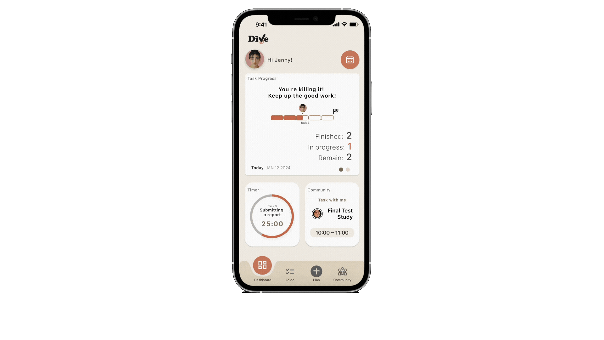
( Dashboard )

.png)


Previous Design
Refined Design
-
I streamlined the information and focused on core details, ensuring users can easily grasp the task process without feeling overwhelmed.
( Planning )


Previous Design


Refined Design
-
I've streamlined the interface and terminology, making it more intuitive and easier to navigate.


Previous Design
Refined design
-
I streamlined the information and focused on core details, ensuring users can easily grasp the task process without feeling overwhelmed.
11. Final Screens


.png)
.png)


( Community Feature )
-
Fosters accountability by connecting users for goal sharing, peer-to-peer support, and friendly competition.
12. Prototype
To culminate the design process for my anti-procrastination app, I developed a high-fidelity prototype. This final stage goes beyond functionality, showcasing the envisioned visual design, color scheme, branding, and overall user experience.
Reflection
I found it fascinating that the underlying cause of procrastination is largely emotional. The challenge was to create an app that wouldn't overwhelm or stress users, as procrastination stems from negative emotions. Therefore, I focused on making the design as intuitive and calming as possible, while also ensuring it effectively helped users complete their tasks. I incorporated accountability features, which users identified as effective during interviews. Additionally, I wanted to leverage AI technology to create realistic and manageable plans, as many users tend to set overly ambitious goals. In the future, I would like to explore the feasibility of AI technology further and, given more time, develop a timer feature that includes rewards to motivate users to continue following their tasks.